Global Warming 101 –Understanding the issue in two easy steps
You hear claims that:
- There is Global Warming!
- That there has been no Global Warming for the last 17 years!
- That Carbon Dioxide is largely responsible for the global warming now occurring!
What is true? – What are the facts?
There are two key graphs that record what has occurred over more than a hundred years with respect to the rise in Global Temperatures and the increase in human source CO2. These two graphs, shown and explained below, provide factual information that reveals what is really known and true about global warming and its empirical relationship to the increases in human source CO2.
Introduction to the issue – After a sustained period of cooler global temperatures from 1944 to 1980 (see figure 1), the earth began to steadily warm again in accordance with the current long term warming trend (since 1650 and a matter of record since 1880, see Figure 2). As we moved into the late 1980’s the earth’s temperature was getting increasingly warm, reaching temperature levels nearing the high temperature peaks indicated in the earth’s previous cooling/warming cycles. People were beginning to get concerned. It was known that man made emissions of CO2 had been increasing rapidly (since about 1945) and it was known that CO2 in the atmosphere is a contributor (albeit a minor one) to keeping heat from escaping the earth. Thus, it was reasonable to hypothesize that the large increase in CO2 emissions by human activities was increasing the rate of global warming. This was a theory or hypothesis and like any hypothesis it needs to be examined, tested, and verified before it is accepted as fact. So let us test the hypothesis!
Step 1 —The first, really important graph, is that of the average annual global temperature based on numerous land and ocean sites around the earth (Figure 1). This plot is the NASA Global Temperature Index for Land & Ocean and you can see it on their site – climate.nasa.gov/vital-signs/global-temperature. It shows the average global temperature value for each year (light red line) in degrees centigrade above or below the 0 reference line as well as a running 5 year mean (dark red line). The data extend back to 1880 and clearly show that there has been net global warming over the last hundred and thirty years. Therefore, that is a well-documented scientific fact! However, this graph also shows that that rate of warming has been irregular. If you look closely at the peaks and valleys of this record you will see something very interesting and very telling with regard to global warming and CO2.

Figure 1- NASA global temperature data plot – (NASA Headquarters release No. 12-020)
The year 1880 is when this record started and it happens to be around the time human source CO2 was beginning to increase. This can be seen on the second important graph (Figure 2). The Fig. 2 plot also indicates that the current warming cycle or trend extended back to 1659. (It happens that the estimated coldest year of the “Little Ice Age” was around 1650). Now, as promised, there is something very interesting when you look closely at the Figure 1 plot. You will see that the average global temperature for 1900 was not exceeded till the mid 1930’s. In fact, there was a net drop (global cooling) between 1900 and 1933 of 0.19 degrees C. Then temperatures began to rise rapidly and by 1944 the average global temperature had risen 0.53 deg. C in 11 years. Now look closely at Figure 1 again and you will see that after 1944, 25 years passed before the 1944 average global temperature was exceeded (global cooling again for 25 years). In fact, by the mid 1970’s there were scientists issuing “alarms” of an impending “ice age” and that forecast was being carried to the public in the newspapers. And why not, the global average temperature in 1976 was 0.37 Deg. C below that of 1944. Brrr was the word of the day. But just as in the 1900 to 1933 period, warming picked up again and between 1976 and 1998 (a peak el Nino year) the average global temperature rose by 0.74 deg. C. This yielded a net temp rise of 0.71 degrees C from 1900 to 1998. So that that is roughly 0.7 degrees per century.
Step 2 – These average global temperature ups and downs are interesting but when they are juxtaposed in time with the record of CO2 increase they reveal much, much more!! So, look now at the graph of the rise of the global CO2 emissions on Fig.2. Note that the rate of increase in CO2 was fairly steady between 1880 and the mid 1940’s and then the rate increased greatly and has continued at that high rate to the present. This step involves examining what happened to average global temperatures for each of two periods (1880 -1944) and (1944 to 1998) and is critically important to showing whether CO2 influenced the temperature based solely on empirical evidence.
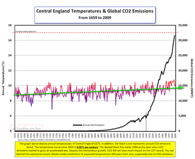
Figure 2 – Warming trend in central England since 1659 vs. annual CO2 human source emissions – source Hadley Centre England
So if we look at the human source CO2 emission rate and absolute quantity of emissions at the beginning and end of each of the definable (warming and cooling) periods on the global temperature record one can note whether or not there is a correlation of CO2 increases to global warming increases. This turns out to be very easy. By inspection it can be seen that there was both a global temperature “cooling” period and “warming” period in each of the two time spans that had a relatively rate of increase in human source CO2 emissions. Thus, it is immediately clear, based on these data that there is not a direct correlation of human source CO2 rise and global temperature rise. To reinforce this point let’s examine in detail the period 1944 to 1976.
By 1944 global human source CO2 emissions had increased to 5,000 MMT (Million Metric Tons) from about 2,000 MMT in 1880. Figure 2 shows that between 1944 and 1976 CO2 emissions increased to 20,000 MMT. So the earth started in 1944 with CO2 emissions at 5000 MMT and over the next 22 years CO2 emissions increased to 20,000 MMT. The global temperature at the end of that period (1976) was 0.37 deg. C lower than at the start of the period in 1944. So despite a quadrupling of annual human source CO2 emissions during the period 1944-1976 global temperatures cooled by 0.37 degrees from the 1944 global temperature value to the 1976 global temperature value. Figure 3 provides a corroborating reference on the rise in CO2 since 1800, and it provides an estimate of the contributors. The original data for the total shown is likely taken from the source shown in Figure 2.
In terms of absolute quantity of CO2 emissions, note that the average level of CO2 emissions over that 22 year period was 2.5 times the level of CO2 at the beginning of the period but there was no increase in global temperature during the period, in fact there was a net decrease. Juxtaposition of the rise of CO2 emissions and the global temperature change with time clearly shows that there is not a direct correlation in time between the two. This clearly contradicts the assertion of a direct correlation between CO2 emissions and global temperature rise, advanced and put forth by United Nations, promoted by the media and now pronounced by the President, and even the Pope. The confidence with which these latter, eminent proponents of cutting CO2 emissions is based on is the endorsement of the role of CO2 in global warming by the vast majority of scientists (as shown by polls). However, the above factual, unaltered and simple portrayal of easy to obtain empirical data clearly shows that (1) global warming is continuing but does so at an irregular pace and (2) that global warming is not significantly influenced by increases in human source CO2 emissions. The corollaries to this conclusion are that cutting CO2 emissions will likewise not have effect on reducing global warming and that other factors control global temperatures, just as they have for millennia. Thus, efforts and expenditures should be directed toward addressing the potential adverse effects of global warming and not on efforts and expenditures on trying to reduce CO2 emissions. Further, reduction in fossil fuel use should be based on cutting the true pollution they produce and the need and value of the development of alternative energy sources.
Those are the bare facts that are essential to understanding the truth about global warming. That brings us to the end of 101, but there is much more to learn. Tune in to Global Warming 102 to learn a few more key facts to help you discern the validity of the abundance of comments and opinions expressed about global warming and the role of CO2.

Figure 3 — global emissions Image from Wikipedia

Good job! Even I can understand it.
LikeLike